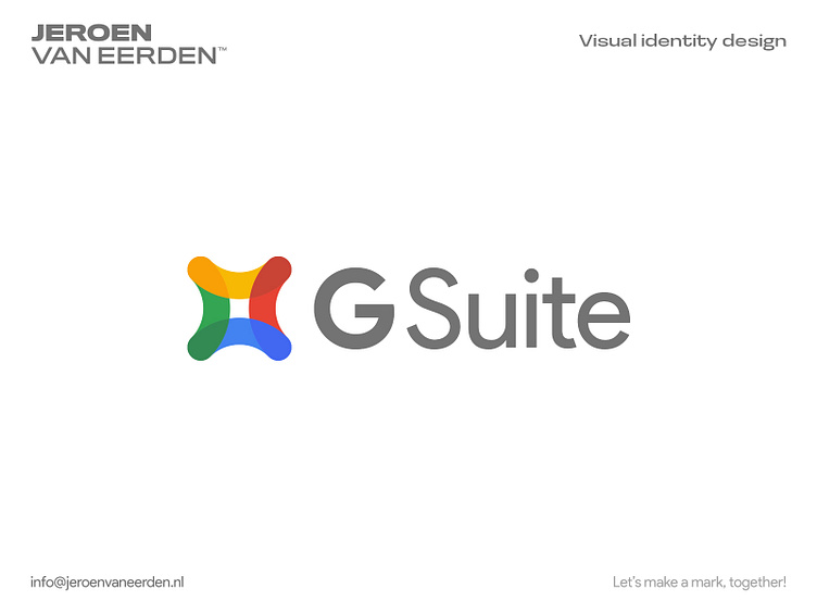
Gsuite - Logo Redesign - 2017
Back in 2017, I was hired to design multiple logos/icons for the Google Suite (G Suite) design system. I made several proposals and worked together with a large team of international freelancers to perfect their current designs. Unfortunately, this concept didn't end up in use but I still love sharing it with you here.
This design felt like something I would expect Google to put out. Simple, effective, and meaningful. Often how I like approaching my own work as a logo and brand identity designer.
Are you interested in working with me?
Feel free to reach out via the Dribbble inbox or direct e-mail:
More by Jeroen van Eerden View profile
Services by Jeroen van Eerden
Like


