Speednet - Full case study
Hey folks!👋
In 2021, we had the pleasure of working with the software house Speednet in terms of their complete rebranding. ⚡️
Speednet is a software house that specializes in building web and mobile applications, tailored to the client's business needs. They have implemented dozens of projects for enterprises from the banking, insurance, logistics, and health care sectors. Their team consists of over 160 IT experts ready to support the client's project at every stage of development.
The project was a great honor for our entire team
and a challenge at the same time.✨
Our scope of work included in particular:
→ The concept and preparation of key visual,
→ Design of advertising materials,
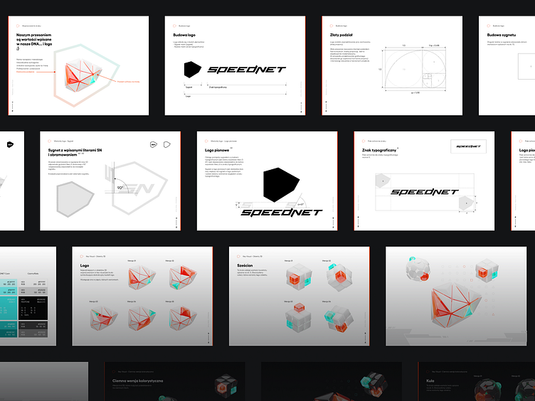
→ Extensive brand book,
→ Preparation of 3D graphics,
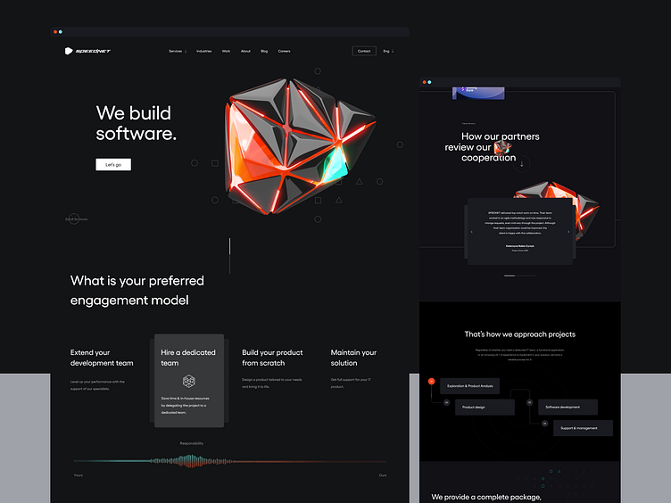
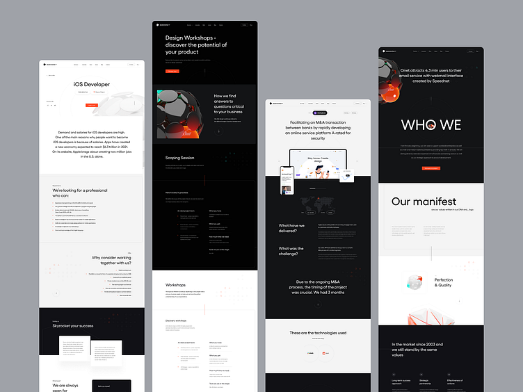
→ UX and UI of the new website,
→ 3D and website animation.
Remember to check out Behance
where we have presented the full case study 🚀
https://www.behance.net/gallery/144546203/Speednet
__________
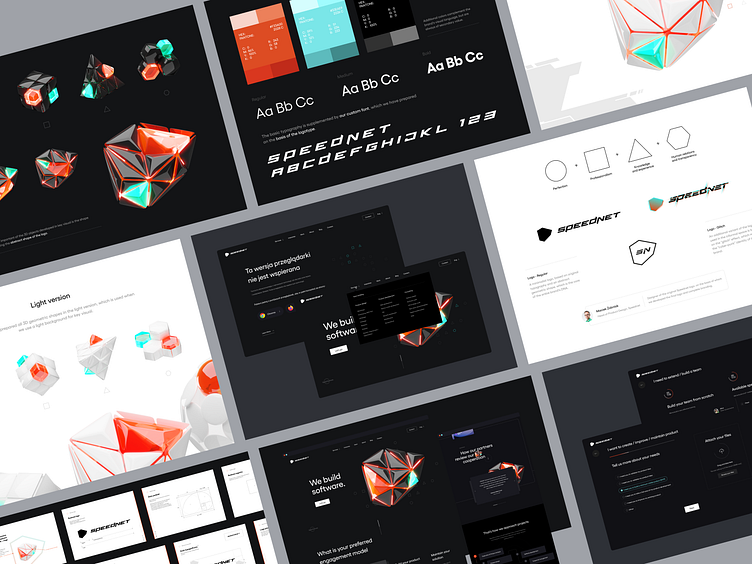
Coherent visual identificationand clear brand guideline rules
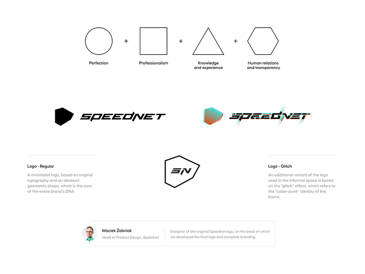
When creating the signet, we had in mind to redefine the way to show the developing world,and above all, technology that never stands still. We have created a logo that will be fastand make these values clear.
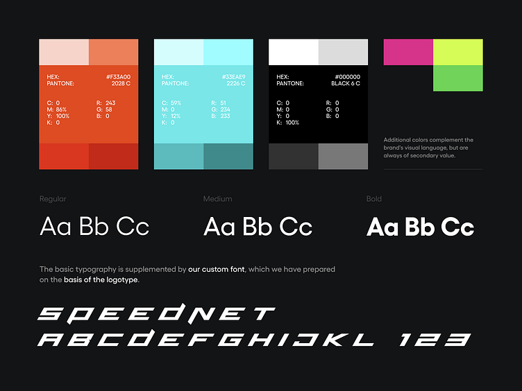
Brand colors & typography
Our colors are as important to us as the logo itself. They are part of the brand's personality.We use two basic colors: SPEEDNET Orange, SPEEDNET Cyan and several additional colors.
A visual key that connectsthe brand vision consistently
An extension to the logo and the basic presentationof the brand is the so-called Key Visual, i.e. the leading graphic theme showing the values with which the brand identifies itself.
Key visual used on other functional and promotional elements of the brand helps to maintain communication consistency and makes it easier for the recipient to recognize and remembering the brand.
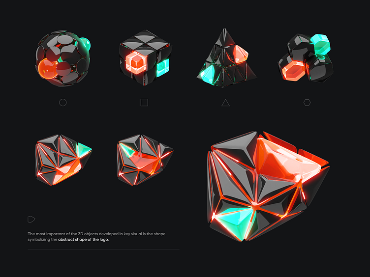
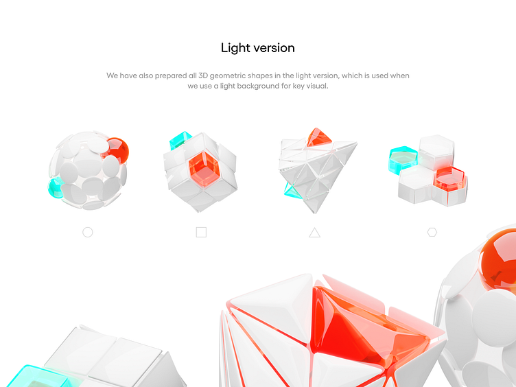
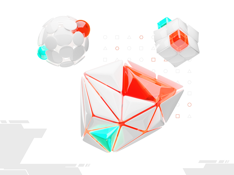
3D Geometric Shapes
The first and most important element of key visual are 3D shapes directly communicatingbrand values. All shapes have a light and a dark variant.
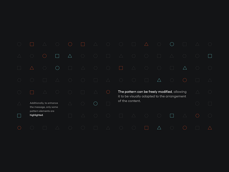
Pattern
Another element of key visual is the pattern,i.e. a repeating pattern consisting of brand shapes.
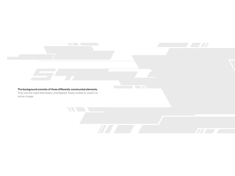
Abstract background
The key visual is complemented by the background, which can be usedfor complementary purposes, improving the overall perception of the brand.
Brandbook & Brand guidelines
The key visual is complemented by the background, which can be usedfor complementary purposes, improving the overall perception of the brand.
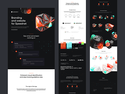
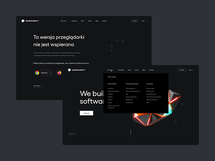
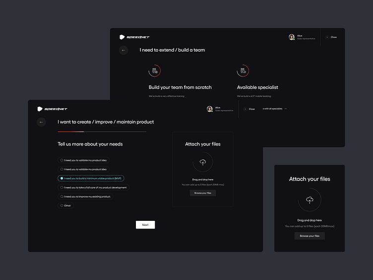
The website completely consistentwith the new brand guidelines
UX/UI Website
Thanks for your attention!
Hit "L" If you like it. ❤️
Soon more! 🙌
Would you like to implement a branding, website or a mobile application,
but you do not know where to start?
💌 Write at [email protected]
and let us find your place in networkspace.
Enjoy and have a nice day! 🚀