EPACENTER ARTS
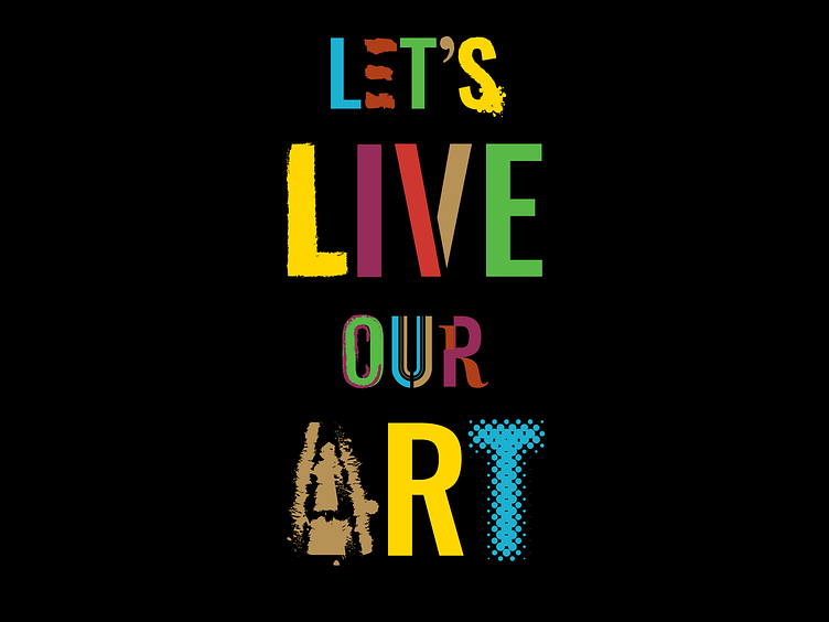
Let’s Live Our Art
A new organization founded to create a full-service, multidisciplinary arts and music facility in East Palo Alto (EPA), California, EPACENTER ARTS believes that the arts transform lives and shape our communities. The organization’s guiding principle is that this center must be conceived of and developed by the community and for the community it will serve. Their brand serves as a megaphone and beacon for the culture and talent of East Palo Alto.
The visual identity tells a story of a varied, creative, and diverse community. It celebrates East Palo Alto as a place where people and ideas come together to create a multicultural fabric.
Visceral, immediate iconography and inspiring copy speaks directly to the reader and positions EPACENTER ARTS as a community beacon. The icons of the logo represent deep roots in the community. A quilt of colors and objects, it’s a reflection of a diverse community of people and ideas. A mix of abstract and recognizable icons invites everyone in by offering multiple opportunities to see their own story.
The visual identity conveys strength and power. White bold type on a black background and translucent, vibrant colors channel life and energy. This solid black background represents the stable foundation from which an artist can take a courageous leap.
The logo and headlines signify that EPACENTER ARTS is a beacon of potential and cultural pride to young artists where the community comes together to create, cultivate, and captivate. Their collateral radiates energy, the contrast of shapes and color creates movement, and the end product reflects the organization’s deeply creative personality.
Creative direction by Rod Lemaire at Mission Minded.
Visual design by Fernando Munoz, Reba Joy Billips


