Branding: Opera Saint Delphine

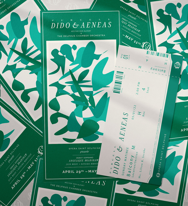
Above: Assortment of brochures and tickets for the performance.
Below: Pasted posters advertising the show's run.

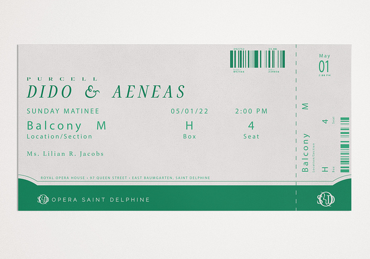
Above: Ticket to the premiere; the color green is closely associated with the company's branding and I wanted to keep the scheme clean so as not to compete with the opera's complexity.
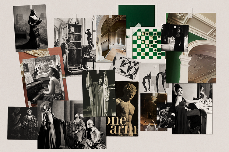
Below: Mood board establishing the aesthetic, inspired by Purcell's Dido & Aeneas (specifically Jessye Norman's Dido) and other mid-century opera divas and sensibilities.
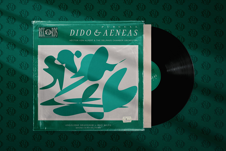
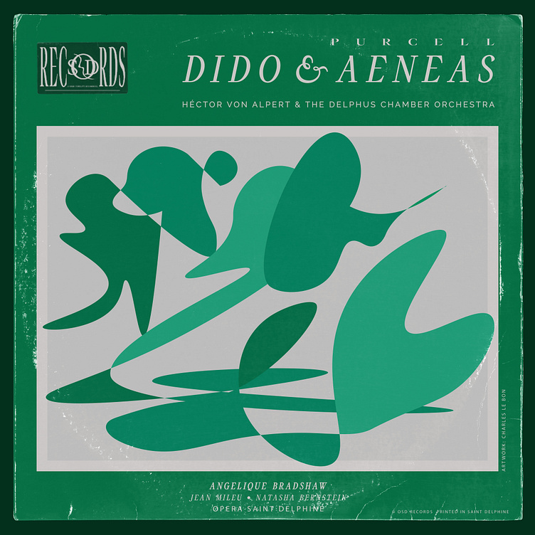
Below: Special edition vinyl of the premiere performance; the cover art (as featured on the advertisements and other printed ephemera) is inspired by mid-century expressionism and the idea of cocktail opera-lovers that ground the brand's story for me as a designer.