Smart card component with component properties - Free to use

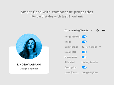
Achieve 10+ card styles with just 2 variants (Default+1)
Component Properties:
1. Image floating will enable thumbnail image to float on top of the card, it can also be disable to view thumbnail image within the card.
2. Image will allow us to either have thumbnail image in our card or to have a card without an image.
3. Select image is useful to swap the thumbnail image from our image library.
4. Image SFX will blend your colorful/gray scale thumbnail image into mono color to match your design aesthetics.
5. Image mask will apply circular mask to your thumbnail image, when it is turned off, it will smooth the image corners to match the card radius.
6. Title label is a text property, where you can input the Card title/name.
7. Description is a Boolean property to enable/disable Card description/line2.
8. Label (Description) is a text property, where you can input the Card description/line2.
9. Image SFX color can be easily updated across the file by adjusting "Color/SFX/Thumbnail" from design system.
10. Background color of the card can be updated across the file by adjusting "Color/Bg/White 900" from design system.
explore many more features from direct Figma file which is available for free.