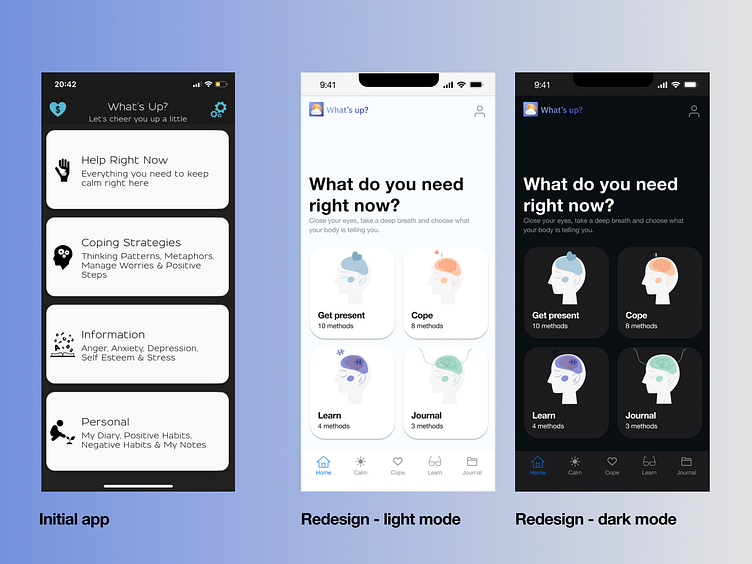
Mental health home screen app redesign
The left screen is a screen from an existing app. Although it has a lot of good and useful information, the way the information is structured and the interface design is created, makes it a very hard to use application. In analysing the existing application, I came up with a different way to categorise the information and represent it with calming colours. The current design is made for iOS platform.
More by Alexandra Paun View profile
Like
