Daily UI Design Challenge 17/100 – Pagination component block

Hi Dribbble family,
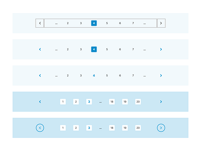
I've developed a concept designs for pagination component blocks for a web application or an e-commerce store.
About Pagination
1. The Pagination component enables a user to choose a page they’d like to hop to from a range of pages provided at the top or the bottom of a webpage.
2. Pagination process allows for segmenting pages containing digital content that is alike in nature, allowing users to skip from page to page or from newer to older sections.
3. Pagination components make the contents of your website easily accessible to users, so they not only enhance user experience, but they also give your website a clean and decluttered look, decreasing your load time by a considerable amount.
4. Pagination also gives users an insight as to how much content and how many pages are left to investigate.
Design process:
1. I've taken inspiration from tailwind CSS component library
2. I've identified the key text elements and input elements that needs to be included for the development of UI block.
3. The key inputs being page numbers and the direction chevrons
4. I've created components for chevrons and the page number and used Autolayout to size the components.
To build this pagination UI block, I've used the following
1. Fonts: Inter
2. I've used iconify figma plugin to gather chevron for navigation blocks
3. In my design, I've used design features and principles such as autolayout, alignment, and font size management to produce the design.
Love to hear your thoughts.
If you like my work hit «L» and follow me to join my 100 day UI Challenge
Thank you and Namaste 🙏