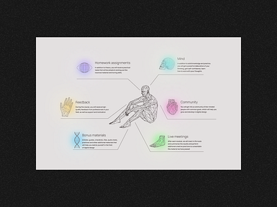
UI design of online design school
𝙏𝘼𝙎𝙆
➔ UI/IX design of a landing page or selling a course based on a brand identity
➔ To combine the 2 key ideas of the course:
1. Magic, Awareness, Space
2. Style, uniqueness
𝙍𝙀𝙎𝙐𝙇𝙏
➔ Used 2 sets of illustrations, similar in style, to interpret ideas.
➔ Colors are expressed in gradients to create a more magical visual.
➔ Atypical compositions for the lending emphasize the specificity of the learning outcomes.
➔ Key points of program benefits are visualized by the composition.
More by Yana Krosh View profile
Like
