PI Colour Palette

https://privacyinternational.org
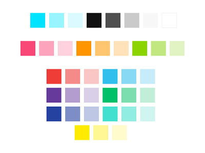
One of the very first things I did for this project was to take the colour palette from PI's new brand guidelines and turn it into a web friendly palette. I spent a lot of time working out which colours were accessible and how they could be used for the web, i.e. which colours worked on a white background, which colours worked with black text on top etc.
We ended up with a primary colour palette of turquoise, black, grey and white, a secondary colour palette for shades of pink, orange and green and a tertiary colour palette for the other colours.
We needed so many colours as we wanted to colour code each different piece of content, for example news articles are red and case studies are purple.