Evernote sorting | Redesign

Is it me or are the sorting options in Evernote a bit confusing? Here are a couple of suggestions (within current boundaries) to improve usability. Would 'old to new' for labels maybe be better?
---
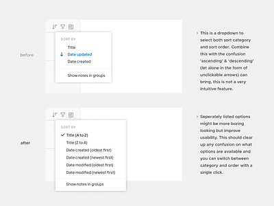
Analysis (before):
• A dropdown to select both sort category and sort order. Combine this with the confusion ‘ascending’ & ‘descending’ (let alone in the form of unclickable arrows) can bring, this is not a very intuitive feature.
Redesign (after):
• Seperately listed options might be more boring looking but improve usability. This should clear up any confusion on what options are available and you can switch between category and order with a single click.