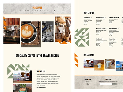
FCB Coffee Homepage
The design for FCB Coffee was actually influenced by their coffee shops. Their recently opened stores had concrete surfaces for the worktops, green geometric tiles for the flooring and fun peg letter menus where the occasional letter was orange so I wanted the website to feel like an extension of their physical spaces.
I also wanted to create something new and unexpected to help them stand out in a crowded marketplace and something with plenty of white space so the coffee imagery could be the main focus.
Squarespace was a perfect fit for this website as it allowed me to get up and running quickly with the individual pages and focus on the details that made this site so unique.
More by Katherine Cory View profile
Like

