Thoughtful Branding


A friend who's a web developer, Steve Kirtley approached me to redesign his company's website, Thoughtful. We began by looking at his branding.
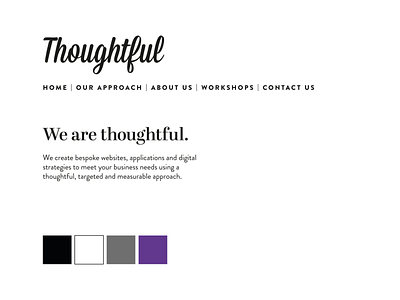
I used some of the website copy and began looking at typography that matched Wisdom Script, the font used for 'Thoughtful.' I came up with four different options, with two being my preferred choices. Steve let me choose my favourite so I opted for Brandon Grotesque paired with Abril Display. We initially discussed only using sans serif typefaces but I felt Abril created a grown-up, professional but unexpected typography system.
Steve wanted to use a purple for his colour palette so I chose #rebeccapurple because it was a strong, impactful shade and I introduced a grey that would be useful for hover colours and give more flexibility to a colour palette.
I also improved the logo; I removed some of the bumps on the banner and I tidied up the curve of the F and L.