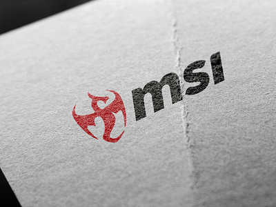
MSI logo redesign (Unofficial)
MSI's logo is notorious for being disliked amongst designers, with the dragon shield emblem being hard to read when scaled down. This is my take on redesigning the dragon shield eblem. Taking the shape of the shield and creating the dragon, makes it legiable even when scaled down to a favcon. View the full project here.
✅ I’m available for new projects!
❤️ Show the love! Press "L". Want to see more projects? Visit my profile or Behance and remember to follow me!
More by Bryant Walker View profile
Like
