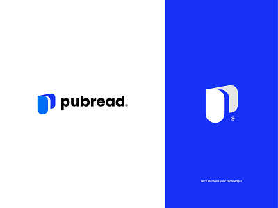
Pubread Logo and Branding Design for an Online eBook Publication
Pubread is an E-Book website where visitors can read all kinds of books for both free and premium. They will provide services in two ways. At first, writers can publish their books on the website, and visitors can read those books as they want. The writers can keep their books free and premium as they wish. If visitors want to read a premium book, they need to purchase it. And the writers will also get a Specific payment from the website if the visitors read their free books! By this, both visitors and writers will be Beneficial. The writer can earn some money with their creativity as it happens on Stock websites. And also the readers will be able to achieve excellent knowledge by reading the books! That's why the name of the brand is Pubread. The name Pubread came from two words, Publication and Reading.
Their aim and their brand naming quality are insane! So, they deserve a great and cool logo! ;-) To maintain this quality, I've designed this logo for the brand. First, I've tried to represent their name, product, and psychological aim in the logo. Then, I've added the first letter of the brand name to the logo, P. Then, I've added a folded book minimally and abstractly in the logo to represent their product which is Book!
In the colour section, I've used a blue colour because we all know in colour psychology, blue is the colour of Knowledge, Trust, Seriousness, Peace, Technology, Modernness, etc.
So, here is the logo that I did. Jokes a part, this isn't an honest brand/company. :D I've fully imagined this. But if any company's aim is like this that I've described in the upper part, they can purchase this product from me! You can just hit any of the contact links given below!
For business inquiries,
WhatsApp: +8801963851346
