Goodreads Makeover
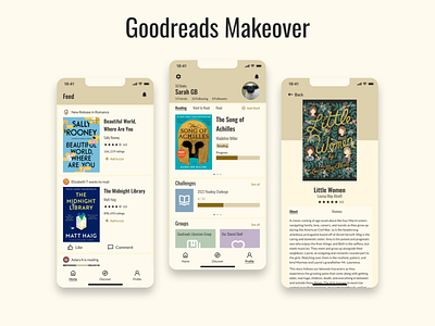
I did a Goodreads makeover! I've been reading more these past few months and my friends and I follow what we're each reading on the app.
I wanted to make it more aesthetically pleasing. I did change the colours to be warmer and nicer. I made it cleaner with bold, readable fonts and flat design.
The original app is a bit fussy. I tried to streamline things and get rid of things that don't need to be there. I don't think they need so many tabs on the bottom. The "More" categories could go under profile or settings. The settings and notifications could be put into the icons at the top of the screen. The search bar can be in discover (like the IG explore page).
More by Emma Wittmann View profile
Like
