Daily UI Challenge - Registration

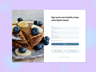
I wanted to take another stab at the Daily UI challenge for a registration page because I need more practise with desktop. I went for a light, welcoming, and fun header text. I paired that with pastel colours to add to the airiness feel that I was going for. Tip of the day - since the rounded corners of the sign up button give the illusion of a narrower width, make it a few pixels wider than your text boxes so that they appear to be the same size!