Aftermath - brand guidelines

AFTERMATH has been one of my fave projects of all times - branding for on-demand streaming platform, dedicated to post-apocalyptic and dystopian worlds.
Naming: AFTERMATH - the consequences of a significant unpleasant event, especially one of a disastrous or unfortunate nature; and a period of time following such a misfortune.
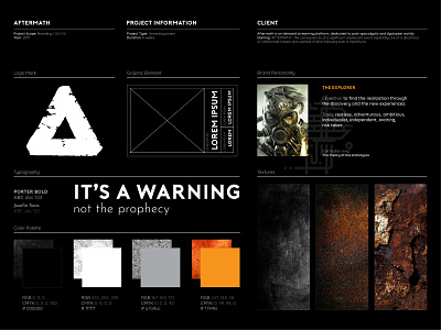
The brand visual language was developed based on brand personality - The Explorer (C. G. Jung "The theory of the Archetypes") - restless, ambitious, risk taker. Distressed textures, bold typography, orange as the accent color and labels as the main graphic element enhances the idea of post-apocalyptic world and dystopian future.