Government of British Columbia logo rework

Since arriving in British Columbia I've never jumped for joy when I saw the government's logo. I found it complicated, old probably because of its colours and the typeface makes it seem so dated (I do love me some Garamond in other situations).
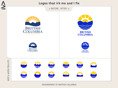
I set out trying to simplify it. Spending a lot of time looking at how many rays of sunshine I could eliminate and still make it look like a sun. Turns out it's at least 5 by the way. The original logo apparently has the depiction of the pacific ocean in it, which I only found out about when reading the design guidelines. I made the ocean much more prominent in my version.
I wanted to use a sans-serif typeface for the wordmark because it modernized it but made sure to choose something that had some elegance to it. I found Minerva Modern which had some variation in the letterforms which I feel help give it some heritage and dependability to it (something the guidelines say they look for in a typeface.
If I was guessing the original logo designer was pushed and pulled by the government to get it done so no shade on the designer!