UX/UI & Paid Ad Design | B2B Security Software Company
Problem:
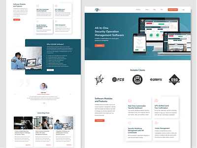
This B2B Security Software Company was looking to increase conversions from their website without doing a complete redesign. Using the same brand guidelines, I was tasked to create a new homepage layout.
Solution:
As a solution for the page content, I added a featured product section and small blurb about what differentiates their company. I removed an unneeded ebook form, condensed the information, and merged the multiple testimonials across the page into one slider.
As a solution for the design, I wanted to give the page a more modern feel that did not feel crowded. The idea was to keep things simple, sleek, and clean.
You can view the original homepage here (prior to proposed design): https://www.csa360software.com/
Other work for this client includes design for LinkedIn ads (seen on 5th and 6th image. Click to expand.)
My responsibilities on this project: Web design
Other collaborators: Senior Content Strategist


