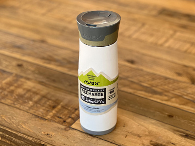
Avex packaging wrap
Shape:
Associate the Avex brand with the outdoors and, most importantly, water.
Colors:
Recycled natural paper with green and blue earth tones. The green in the
packaging keeps consistent with the green used on the website and blue is a
logical compliment, denoting water.
Typography:
Gotham and Conduit – Gotham is very readable and Conduit works as both a heavy or thin condensed font to help to highlight or fit more info in a smaller space.
Bottle illustration:
Highlights and explains key features – makes it obvious why this is a
superior product when displayed next to the competition.
Icons:
Easily consumable way to present features at a glance.
Hashtag:
Calls attention to advocacy.
More by Lynda Maldonado View profile
Like

