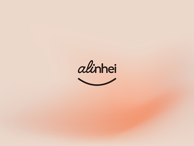
Alinhei - Brand Identity Project
Visual Identity project for Alinhei
THE BRAND
Alinhei is a brand of invisible aligners that seeks to correct dental irregularities. The name Alinhei comes from the purpose of aligning and leveling people's teeth, transforming smiles, and transforming lives. The brand proposes to offer a highly sophisticated, quality, and affordable product, without links to dentists. The consumer can acquire the product through direct sales, differentiating from other brands’ practices.
CONCEPT
Transform smiles, transform lives! The motto and brand name were inspirations for the visual identity concept. The visual signature is composed of typography, the “smile” symbol is an additional complement to the visual signature. The typography used in naming starts in an italic handwriting style and transforms into a modern sans serif and sans italic font style.The idea is to transmit transformation, change, and alignment through the symbology instilled in the brand's logo, a reference also to the main archetype of the brand, which is the Alchemist.
Take a look at the complete project at:
Feel free to reach out via DM or by Email:


