Social Security System (Case Study)

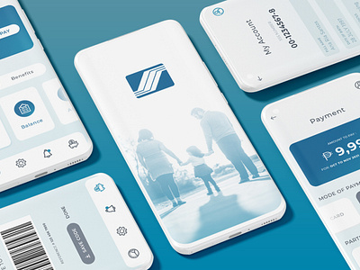
The Social Security System is a redesign of its existing mobile app. The primary goal of the redesign is to address the issues on content hierarchy, navigation, and options for its functionalities.
A clean and modern design has been implemented to improve the issues on content hierarchy and navigation. The color scheme of the app is a contemporary application to the existing color palette of the government agency.
To further improve the content hierarchy of the mobile app, the entire content is analyzed as a prerequisite to reorganization. Data is gathered to identify the frequently used features and services of the users, so that appropriate hierarchy is applied to the design. For the navigation issue, consistency and familiarity is key. Data on user touchpoints and journey in the app is analyzed to improve strategic placement of the navigational elements. Lastly, to improve the app’s functionality and public service, a variety of options are provided to ease the user in completing transactions. These are third party partnerships in receiving and making payment to complete government related services in the app.