Brand identity

About the project:
Develop an identity for a bag brand called Khovanets, which translates as hiding. The bags themselves are bright, and the target audience is 16-30 years old, creative, and socially active people.
The main requirement for the logo and identity is a minimalist style, but it is allowed to be creative.
Realization:
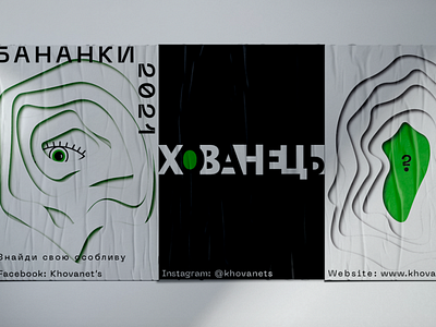
I decided to stay on the brand name (hide) and reflected it in the logo.
The letters are arranged in such a way that it seems that they are hiding behind each other.
The green is the accent color in the logo and identity, as the brand owner said that in the future they want to create a website and Instagram page, so they can use this color to identify the brand.
The posters and T-shirts were designed to follow the concept - hide. Reflected as having something hidden inside.
The green color was chosen as the accent color because it represents the vivacity that is suitable for the target audience of the brand.