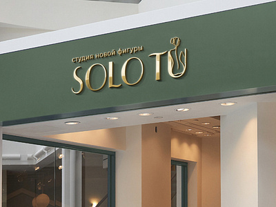
Logotip for body shaping
Task: to develop a logo for the SOLO TU figure correction studio. Translated from Spanish, "only you".
Company services: hardware massage (cavitation, vacuum massage, RF-lifting, pressotherapy, wrapping)
Target audience: individuals, mostly women from 25 to 50, who want to adjust the figure, remove extra centimeters, without exhausting workouts.
Visual image: a female figure (for example, from waist to hip or from head to hip, not completely),a silhouette of a girl embedded in the font.
Color preferences: use a green color scheme (closer to darkor pink-brown)
Logo character: modern, businesslike, light
You can contact me:
Mail: [email protected]
More by Natalia View profile
Like
