How to do accessible neumorphism
So I'm currently using the daily UI challenge to explore different UI aesthetics. And of course I've certainly kept an eye on Neumorphism which seems to still be on the rise here on it's second-or-so year.
So why aren't there more neumorphism on real-live websites? I think a big part of the reason is that it clashes with a huge current and super relevant mega-trend called ✨ accessibility ✨. Thing is, even though neumorphism looks beautiful with it's pushed out, almost clay like elements, it's difficult to see even with a near-perfect vision. Even harder on a dimmed screen. With accessibility legislation on the rise as well, it's really a challenge.
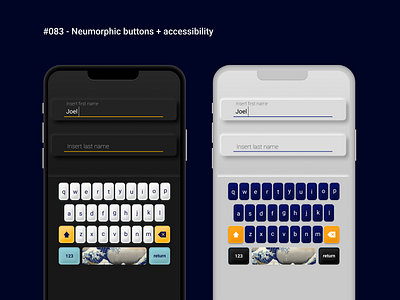
So in order to do it in an accessible way, letting more people enjoy the beautiful aesthetic really, is to make sure that the core interaction elements are placed above- and more prominently, than the neumorphic elements. Those will then become supplementary decorative elements. As for buttons we can't really place drop shadows and lighting as it would risk blurring out the contrast between UI element and background. Instead we can play with decorating the button with shading and create weird rounded or bordered shapes instead. It might make it a bit more skeumorphic, but well, that's not so bad. Is it? In the end we're gonna create solutions that are less unintentionally discriminating and, essentially, better experiences.
I tried to mimic my beloved Ducky One 2 Mini with custom key caps I have here at home. I know, I know, the wave space-button isn't the most accessible solution but I couldn't help myself.
Hope you enjoy it!
/Joel
