Primo Prerolls Packaging
Primo Cannabis or Primo for short, provides the cannaseurs of Arizona handcrafted prerolls, edibles, beverages, topicals, oils and cannabis flower. They are commited to providing the best cannabis and delivering the best advice.
When Primo reached out to me for branding, and packaging I quickly realized that in addition to a visual identity and packaging, they needed a clearer message and a more developed brand strategy and voice.
With an effort lead by myself and the internal creative lead Kyle, and through intensive workshops and constant communication on the daily. We helped define their identity and voice, while leveraging the Arizonian and cannabis culture to allow the Primo team to fully understand the cannaseurs of the Southwest, and optimize their potential earnings through the quality of their information and products.
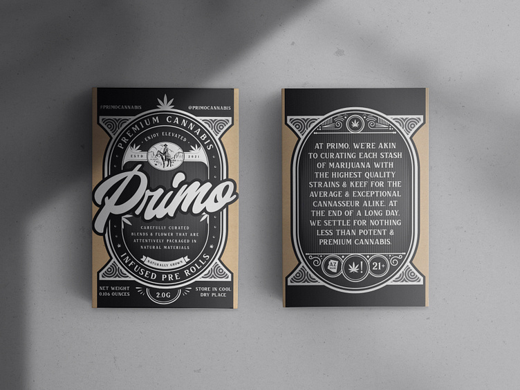
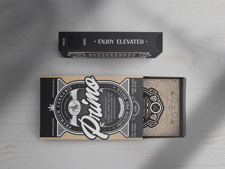
This rock-solid effort set the stage for our strategy to be both inventive and appropriate for their customer’s needs. What’s more, after developing their visual language from the ground up, and making some recommendations, I quickly got to work. The word mark is an approachable, yet elegant representation, utilizing a variety of font types and weights to convey the ruggedness of their identity; specifically their ability to help their customers get to the absolute best, most effective cannabis.
Today, adapting to the ever-changing times can be a gargantuan task, and in today’s marketing a brand must be more than just a pretty face and a smooth voice. So the audience they were speaking to played a big part of crafting our identities’ tone. Based on the idiosyncratic nature of their business I felt the industry already had enough people speaking to the quality of their product, so we decided to lean into a wise yet approachable tone, one grounded in a more experienced with sharing as a core value. To that end, the fonts chosen were very important, if not more than the logo badge. Verbal identity is the new brand identity, so in this case, we chose a refined and robust script called Charles by Habib Otang combined with a bold and vintage display font, Bvas Estadas by Asthenia for Primo’s headlines, and finally rounding out the brand with Arimo by Steve Matteson which provides the refreshing and approachable aspects to Primo’s identity.
The design system ultimately came to fruition in the prerolls packaging, with its wise yet modern aesthetic. The packaging celebrates their mission and shares the unique combination of wisdom, trendiness, and environmental friendliness that differentiates Primo from their competitors. All the elements including, brand, typography, color palette, photography, iconography, and packaging do well to support the new brand strategy and messaging platform. I’m so excited to have formed such a strong partnership with them and can’t wait to see the Primo grow and evolve from here.
––
My Role:
Brand Strategy
Brand Identity
Art Direction
Copy Writing
Iconography
Packaging Design