Legs

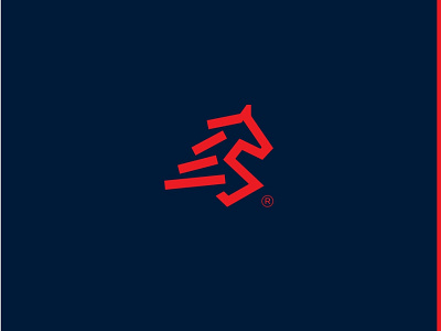

Logomark incorporates geometrically crafted abstract forward running horse with legs along with having goods at back to be delivered, designed in a minimalist manner to stands out more among other wordly brands.
The logo is very balanced, adaptable, and scalable to every possible usage, the logo is really relevant and up to the client's standards and needs.
The typography is designed as custom minimalistic to have proper harmony with logo mark and business, the typeface used for the brand is ‘Poppins’ & ‘Roboto’ for secondary text.
The colors chosen are inspired by modernism and your choice, used current website colors just enhanced red and used same navy blue color as compliment background.