7ZERO

· I wanted it to be geometric as well as incorporating “7” and “Z” together as when the user reads it they will think of “Seven Zero” as compared to Seventy if I incorporated 7 and 0 together.
· The aim was to make the logo as minimal and simple as I could with an added element of creativity by merging 7 and Zero together.
· The color black was chosen as it represents a sense of luxury, mystery and looks neutral. The color also suggests the company means business and has every idea of what they are doing.
· The font chosen was also sans serif as within the film production industry, most of the fonts used were sans serif and it made sense to go with it, moreover, a bold sans serif font was perfectly suited for the logo
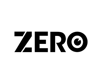
On the letter “O”, I have added an element of a camera to relate it to the film production industry, so the user can identify that the logo belongs to the film industry, however, the camera has been designed in such a way that it doesn’t seem too obvious and feels like a minimal detail.
Contact me for logo design requests: