Snapchat Redesign - Material Design

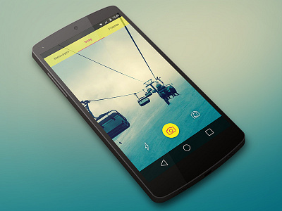
For now this is just a work in progress, a redesign of the well known app "Snapchat".
There are lots of users complaining about the current UI of this app, it's a little hard to understand for most of them.
For example, the squares that appear on the left or right side of the camera button - they are squares with number but what they mean? There's no label or icon to help users understand them.
This design is inspired on Google's Material Design but not 100%, at least for now.
I will post more screens soon.
Leave your comments and suggestions!
Thanks for watching
Flip Camera icon designed by Rohith M S from the Noun Project