Shrinking (and growing) the logo

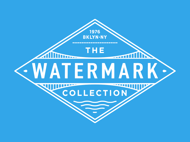
A very quick look at a new logo just completed for The Watermark Collection.
To build a bit of fun into the identity, and make sure the logo worked at smaller scales, I created four versions, each designed to work at a smaller size than its predecessor.