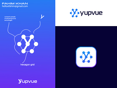
Yupvue — Branding & Identity
Hi everyone,
Share with you the final results of logo design project i recently finished for
“Yupvue”.
'Yupvue is social media platform'
I try to keep This logo, simple and minimal.
Because people like and remember simple logo more
And I tried to keep this logo one color as well as gradient.
I've tried to embellish this logo main service of 'Yupvue' as well as the first letter of Yupvue Name 'Y'.
Because when people will see this icon so they can easily remember the logo name.
Have you ever wondered why most of the major social media platforms, like Facebook, Twitter, and LinkedIn, utilize various shades of the color blue?
Actually Every shade of blue evokes a different emotion.
i try to use perfect blue for 'Yupvue'
Blue is truly a fan favorite color on the web.
This makes sense in regards to websites designed for communication and engagement. Blue is the color most commonly associated with communication it's fluid and calm and evokes a safe feeling that every person should love having.
Most other colors tend to distract the consumer, whereas the color blue disappears as a transparent background
👇CONTACT FOR FREELANCE WORK
--------------------------------------------------
📩 Say hello Email : [email protected]
☛ Whatsapp : https://wa.me/+8801764998704
☛ telegram : t.me/helloofahim
