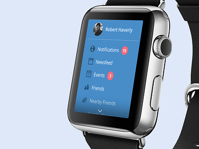
Facebook Apple Watch UX exploration
A quick and dirty Facebook Apple Watch study, with some light UI. There's definitely some interesting challenges. I can't wait to get my hands on one (or one on my hand...) and get a feel for the real-world tap sizes and/or scrolling/clicking.
The major challenge is tailoring an interaction-heavy application, to a microscopic screen. A few problems I worked through and am still working on:
Consistent drawer icon: Having a back arrow or some kind of persistent top level navigation does not seem like a good use of space. I decided to solve this by adding an always-present puck, to access the drawer.
Text overlay on images: I took the full size image approach that Facebook already uses in it's mobile apps, and scaled that down to watch size. All images in the newsfeed would have an overlay, with an excerpt over it. Tapping the image would give you the full image, without the text ontop of it. The full text might be a secondary action when on a full image.
Likes/Comments: Writing comments on your watch seems a bit absurd, even with Voice-to-Text. But Likes will be easy enough. You may want to read the comments, but even that seems a bit tedious to me. I would think that on a watch, a simple Like would the primary action in Facebook. The placement for Liking and viewing or reading comments is still something I'm playing with.
Font size: This is quite difficult to visualize, even with a paper prototype. My thinking is that the font size I'm using in Notifications and the Drawer is about right. But scaling that to large status updates in your Wall is quite a challenge.
That's it for now. Enjoy!
P.S. Check the attachments for full size version of the drawer, notifications, and your newsfeed.


