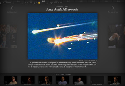
Decade for posterity
So, I got word today that upper management finds the design "too New York Times" and too big for the majority of our users' screens, so now a bunch of cooks are going to come into the kitchen. The former complaint seems misguided as I'm strictly trying to create a subtle container that will let the photography and videography come through, and the NYTimes excels at this. The latter complaint is only valid if you assume people can't scroll.
I want to hold on to what it looked like before they touched it.
Sorry, I'm using Dribbble to bitterly vent. I guess it's the new Twitter now?
More by Bill Couch View profile
Like

