Mobile offer Multi Network - cards & tables

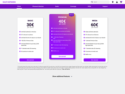

Tables are one of the most boring designs out there. This project was all about making them simple, but fun. I decided to create 3 mobile plans, where one is more recommended than the other two. This project is a part of the UI Learn online course by Denislav Jeliazkov.
Challenges I faced and how I overcame them:
1) I was struggling with a lot of information that should be included, so I made simple cards with the most important information on top and put everything else in the tables below.
2) I wanted to make it very obvious that one plan is preferred or recommended above the other two, so I put it in the center of the screen and used colours to stand out from the other two. I also made a little banner (Popular) on top to make it even more obvious that this is the plan a user should look at first.
3) In the tables I also used purple colour to highlight the preferred plan as I wanted to stand out from the other two and also it's consistent with the upper cards.
4) Creating tables with the auto layout was a lot faster and simpler to do, but I didn't know exactly what to do when there is additional information in the cell. I put it below the icon and also equipped the row with an information icon so that the table is simple, but the information is still reachable.
What I learned:
1) How to reduce information and how to display it to make it simple to understand and easy to find.
2) How to make the preferred plan stand out.
3) How to make cards and tables consistent.
4) How to create a simple and beautiful table with a lot of information.