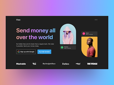
Money transfer
UI Design is craft like any other. To master your craft you need to train your eye and techniques for a thousands of hours. We are always learning and testing. This is the output of our internal experiments for our new Fintech client. Aim was younger generation, usage of dark mode and abstract shapes.
What do you think? Please let us know in the comment section!
****
We’re open to a new collab! Contact us at [email protected]
****
More by Thirdweb.studio View profile
Like
