Fake graph
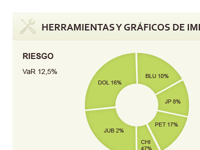
A fake graph for VaR (Value at Risk) on current portfolio.
In this fake, every stock is green, but we will give a different colour for each one.
Should we let the user choose these colours? maybe... it could be more user-friendly then.
A fake graph for VaR (Value at Risk) on current portfolio.
In this fake, every stock is green, but we will give a different colour for each one.
Should we let the user choose these colours? maybe... it could be more user-friendly then.
