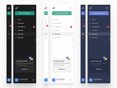
Sidebars
Sidebars aren't the most creative canvas to work with but sometimes they can really difficult to get right, especially when designing applications or websites with a lot of content and nested navigation items.
Take a close look at this shot starting from the top and working your way down each element. We've been careful to match icons closely to the navigation item, allow for plenty of empty space and even throw in a call to action.
We wanted to show how much functionality can be packed into a navigation (which can fold away) if you keep the interface minimal and neat. I think you can agreed we made this point clear :)
We're in the midst of wrapping up for the year, but we'll be rearing and ready to go early January 2021! If you're hunting for potential designers and developers to work with, drop us a line.
