Brand identity // Polygraphy

Hey guys! 👋 If you like our design, please put your likes 💟 and leave a comment!
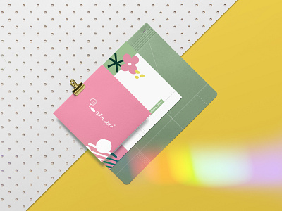
We have developed a polygraphy design concept for the publishing house of children's books Ash and Beech.
The publishing house strives to produce such books so that children notice the good and unusual around. Therefore, we came up with simple, slightly "childish" illustrations depicting elements of the landscape. We chose bright joyful colors: yellow, pink and green. Linearity allows you to align texts and other elements either on offline or on online media.
Check out the case on Behance
Write to us if you need identity, graphic and motion design, packaging and website design. We will be happy to talk!
📧 Email us: [email protected]
📲 Or contact our CEO Sofia on Telegram