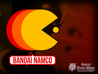
Mock Up: Bandai Namco's 'New' Logo
NOTE TO SELF: Figure out how to deal with Dribbble's funky cropping.
Anyhow, a few weeks ago, Bandai Namco announced that they were going to start using a new logo next year and...uh...it wasn't well received by fans and designers alike. Including me.
I look at it and think 'this is the logo for a website that WRITES about video games'. It just gave off feeling of being uninspired and dull. Again, it just doesn't feel like the logo for a big name developer. And like many others, I decided to throw my hat into the ring on trying to fix it.
For my take, I wanted to keep the color scheme from the former amorphous blob/splat logo while incoporating one of Namco's most iconic characters with the red type from Namco's original logo.
It just seemed like a no brainer to make Pac-Man the main centerpiece of the design. He IS one of the most recognizable video game characters of all time after all, plus the previous logo did incoporate his color scheme (Yellow from his body, orange from his gloves and red from his boots).
I tried to call back to the original Namco logo with a bold red font, but I decided to use something a touch more 'modern' while also keeping the word-bubble dealie from the new logo.
Y'know, I'm not one to say I could do better than whatever big design house they contracted for the new logo...but it's really sad when an unaccomplished amateur like myself can design circles around whoever they hired.
