Nine — Colors usage
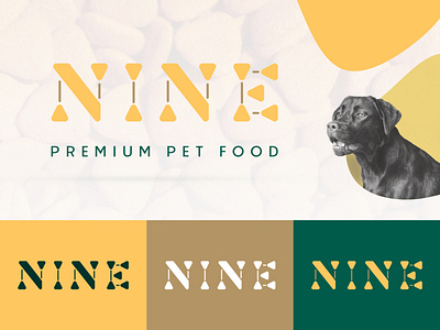
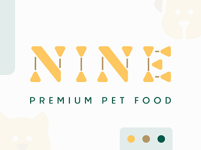
💡 The idea in general revolves around a store selling food and supplies for pets such as cats and dogs, In the logo design phase, the focus was on the common shape of dried food for pets, and the rounded ends were used to express the affection between the pet and its owner, and on the other hand on Adaptation and keeping pace with the times later, While the different types of food for pets were expressed by highlighting the contrast between the thin body of the letter and its Bold ends.
💬 Let me know your opinion in the comments section and if you want to see more staff like this.
✉️ Let's work together! [email protected]
Don't forget Follow me