Delardino HVAC Logo Design

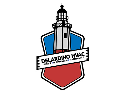
Delardino HVAC came to Greg looking for a new take on their original logo which they called “generic and boring.” He decided to incorporate elements from both the HVAC industry and Long Island, NY as a way to visually tie in both their business and hometown. When deciding a location to symbolize, he chose Montauk Lighthouse because it serves as a physical navigational aid and he wanted customers to be pointed in the right direction. He chose a red and blue color scheme to represent the warmth of heating and cold of air conditioning. The client wanted to incorporate a shield into the design, so Greg had the lighthouse pop out from the shield, just like they appear on the horizon when you get closer to the shoreline. He put the colors into each end of the shield to make it pop on any background.