Pub Logo Design

Designing the Pub logo was a very amusing project that involved learning about craft beers and hops and malt and etc, which was also very fun!
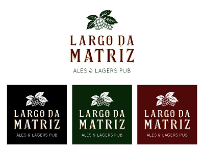
The Pub logo has three elements that dismiss any explanation. The hop is allusive to an important ingredient of beers, used to give aroma and bitterness. The name of the pub carries a unique typography, used to evoke the bohemian history of the building where it is located at a historical square in south Brazil.
To sum up everything, the client asked to create a headline that could also be used in the logo: Ales & Lagers Pub seemed to be the perfect one, avoiding from cliché and telling exactly what would be found behind the massive wooden door.