Universal Data Visualization | Styleguide
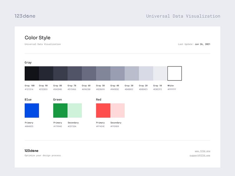

Universal Data Visualization is a high-quality tool for creating charts and infographics in Figma. Easy way to visualize your data in seconds.
DATA VISUALIZATIONS
— Line Graph
— Donut Chart
— Pie Chart
— Bar Chart (Vertical)
— Bar Chart (Horizontal)
— Number
— Maps
INSIDE
— Getting Started (Guide)
— Four pre-made Dashboards
— 80+ pre-made Blocks
— 100+ Components
— Styleguide
— 105 Icons
PRODUCT FEATURES
— All shapes are vector based
— Well organized library
— Easy to change an Instance (Support Figma's Variants)
— Easy to change colors
CONTACT AND SUPPORT
I appreciate your comments, likes and shares.
FOLLOW