Rebranding skincare line


Hello there !
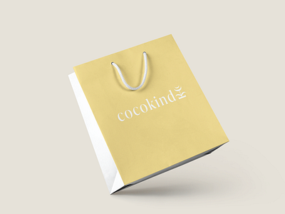
These are my stationery and packaging designs for the “Rebranding a skincare line" passion project.
The idea here was to emphasize that the brand relies on kindness when dealing with their products. The flower that is now part of the logo contains the letters “c” and “k”. The base and leaves form the letter “k” (vertically), whereas the top of the flower contains two “c”. Kindness supports nature.
Thank you for your likes and comments !
For any business inquiries send an email to [email protected]
Instagram: studio.myrnkdesign
Behance: www.behance.net/myrnkdesign