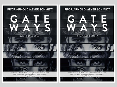
Gateways book cover design
In the end, the black and white versions of the eye cutouts worked better than the colour versions. Used two different gradients to focus the eyes to the heading and centre of the book cover
More by Enoque Carrancho View profile
Like
