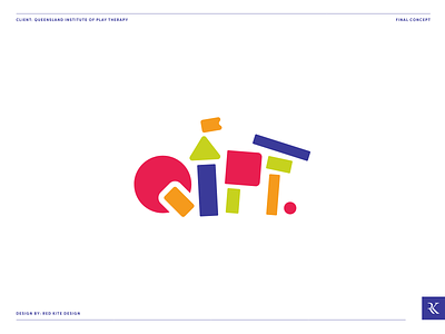
Queensland Institute of Play Therapy Logo Design
The final logo design for Queensland Institute of Play Therapy. Part 2 of the Blooming Heart Therapy Project.
Queensland Institute of Play Therapy is a new organisation founded by Sarah Harwood of Blooming Heart Therapy. In the absence of a governing body for play therapy in Australia, QIPT aims to fill this role, providing support, supervision and education to those working in the field, as well as those in associated industries (e.g. teaching, child care, psychologists).
Our goal was to create a brand identity that captivates Sarah’s fun and energetic approach to therapy, whilst maintaining the level of professionalism required for an industry governing body.
Our final logo design uses the theme of children’s toys again, forming the initials QIPT out of colourful kids building blocks. This is a playful reference to tools that may be used in the therapy process. Once again the style of this icon strikes a balance between fun and professionalism, remaining industry appropriate and not too childish. For the final logo we went with bright and vibrant colours with a more playful feel, maintaining purple as a primary colour for its association with knowledge and leadership.


