Nannina Rebrand | Logo Animation
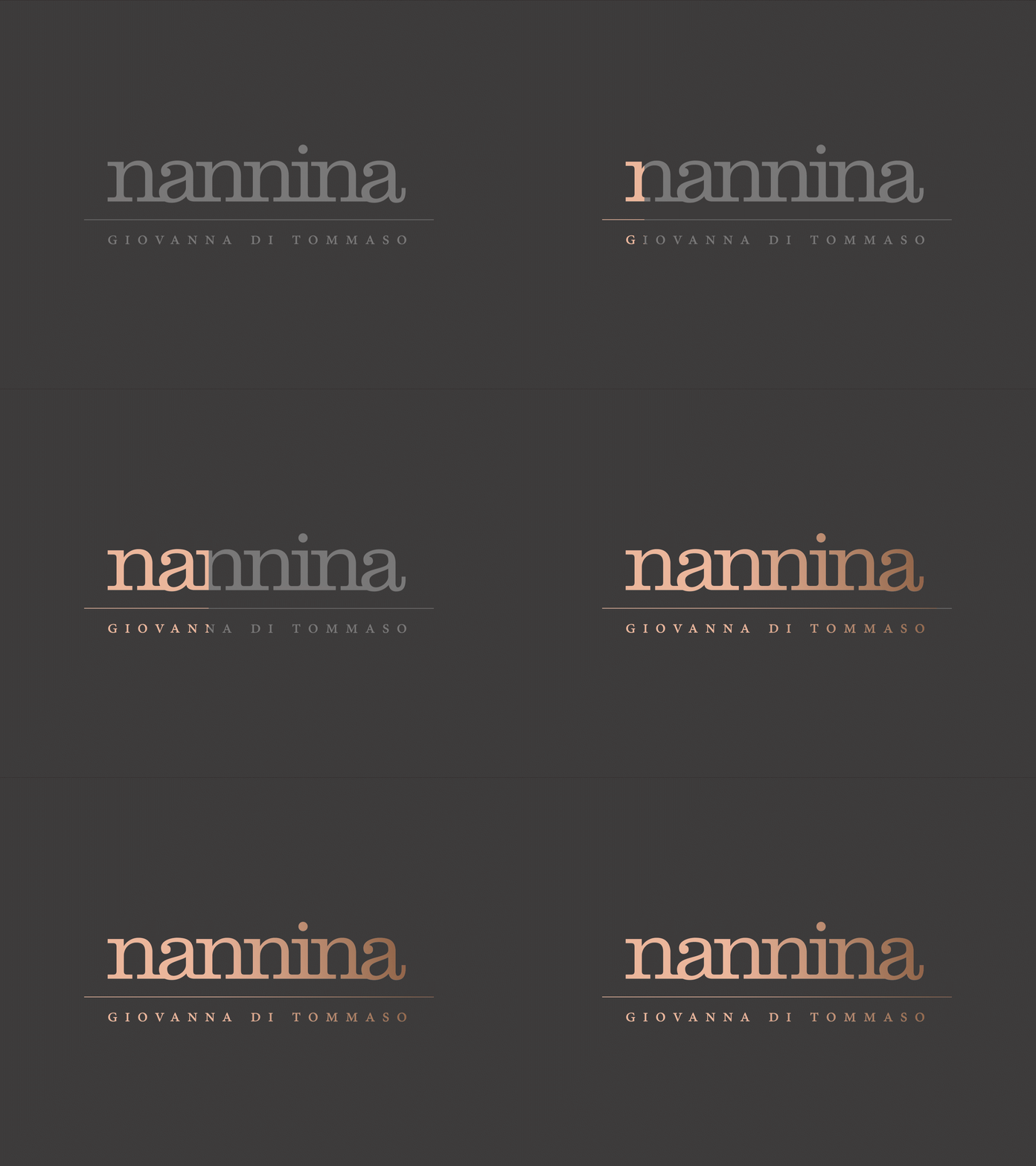
A simple logo animation for Nannina, I used as a preloaded for their new website (2019).
___
Nannina turns classic Italian dishes into near-religious dining experiences. The setting is elegant, the service impeccable & all comes brimming with amore and a dash of down-to-earth humour.
Their old website, was clunky, slow-loading and overall didn't bring across their brands's unique personality, their love for detail and the art and craft of cooking. Which, after all, was what garnered them an almost cult-like following among Stuttgartian gourmets.
"Yes, we are Italian, and, yes, we serve and delight, with Italian food. But Nannina isn't your run-of-the-mile Germanized Italo-kitchen with Pizza, Pasta, Pesto. Nannina is an attitude, a way of being. Both with food AND with people. We’d love that to come across at a first glance.“
Fabio Di Tommaso, CEO Nannina (translated from German)
They also had numerous new services and offers their clients weren't aware of that needed to be featured on their homepage.
new in-house cooking classes
an exclusive catering service, where they actually cook live at their clients house
as well as selling their own privately labeled olive oil and homemade cantuccini
FURThER REQUIREMENTS
easily accessible user interface for updating the website personal
mobile responsiveness
and easy to use interface for clients
the menu shouldn’t be the most prominent thing on the homepage
If possible, their old logo, was to stay the same, so they wouldn’t have to change the time
MY WORK
brand strategy
art direction
photography (by Tim Cavadini)
identity redesign
UX and UI Design
messaging + copywriting (german)
-
development in Webflow
I held a conducted a two-day-brand workshop, creating story-driven client avatars, and prioritising business and marketing goals in alignment with their core values.
I spent two days at location to get an up, close and personal idea for their operations and, — and, frankly, to eat myself through the carte. Life is tough, but I soldiered on.
Based on the strategic framework, we came up with three different angles for the art direction, show-cased to the client in form of comprehensive mood-boards.
The winning direction, dubbed „down-to-earth elegance“ was inspired by their minimalistic, yet elegant interior, the earthy mood of Mediterranean wine yards and Giovanna’s stunning knack to turn simple ingredients into culinary statements that create meditative silence around.
Keeping well within the brief, rather than changing the existing word-mark we used it as starting point for the whole identity.
Thus, the generously letter-spaced Clarendon from the bottom part of the logo got a second use in the primary and secondary headings throughout the project, while the copper-gold gradient treatment of the logo evokes a sense of luxury.
RESULTS
The site won HONORABLE MENTIONS on AWWWARDS.com
And for the rest let’s have Mr. Di Tommaso do the talking for us:
„We are getting calls multiple times a day of people complimenting our new look. Our clients love the new website. Actual bookings increased by 12%. And we have so many people calling for our cooking classes we had to raise the prices to 500€ per person. Needless to say, we are delighted.“
Fabio Di Tommaso, CEO Nannina (translated from German)
