Daily UI #35: Blog Post
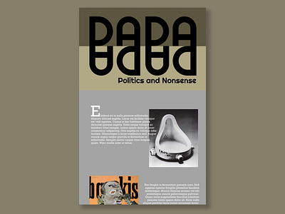
I like to think of blog posts as pages of a magazine, so I wanted to make some design elements using typefaces and found the above typeface worked wonderfully when flipped vertically and horizontally since the word Dada is somewhat symmetrical. I kept the colours muted to make the images stand out and give a sense of age since the Dada movement is from the 1910s and 1920s.
More by Lisa Lavin View profile
Like
