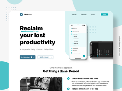
Product Design & Landing Page UI/UX + Case Study | To-Do App
Hey 👋,
I was lately working with an agency, where we'd be researching on people and their lost productivity during the pandemic. Majorly working remotely, the tech work-culture has seen a great amount of lost time management.
Blame poor collaboration or effects on mental health, work suffered.
The Project
Orient Axis (MVP still in funnel) is a balanced, minimalist, and essentialist approach to battle out complex tasks and projects. Meant to be used to freelancers, agency owners, and tech entrepreneurs.
The Challenge/Gap
Amongst many bigger names, to-do app has become the "template" to just create app and get started in the SaaS industry. But after researching and testing with 22 users of existing to-do apps with paid plans (8 freelancers, 1 small team in a branding agency, video editors, and photographers) we found out that to-do lists just stay as they are created, stagnant to the core, with just 35% of the actual listed tasks done.
Reasons?
Distractions. Social Media. Calls. We all have been there, numbers won't speak for this.
The Solution
Along with AdSpace, we created user personas based on the studied users. We're working on this minimalist MVP where a user can put the tasks, including personal life ones. While the focus remains on work-specific tasks, it is nowhere to be forgotten that the user also has a personal life.
Flow
Once tasks are put under work category, user can enable a distraction-free mode. This will work on permissions of the device. Once enabled, the app will put all the distracting apps (Social media, Movie, & Media apps) to an hibernate mode or silent notifications until work-tasks are ticked.
The product might see some calm/lo-fi music integrations in near future updates post launch
For work enquiries:
👋 Say hi in the inbox @ [email protected]
