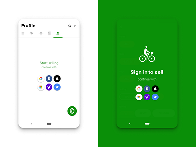
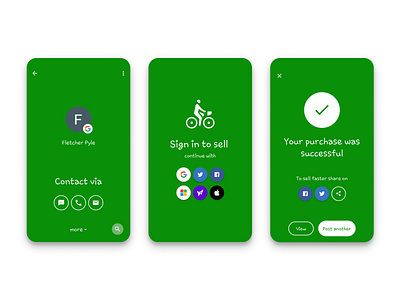
Sprocket Android Metrics Rearranged Sign In
Had to fix sizing on the sign in buttons - took the opportunity to change the order optimizing for the ones used the most in my app in order to further increase conversion. Also they're currently 40x40dp and butted up against each other in 48dp squares - what do you think of increasing them to 48x48 w some space in-between? 🤔
If you like it, don't hesitate to click "L" 💗 or "F"
Sprocket Bicycle App on Android - Sprocket Bicycle App on iOS - Sprocket Bicycle Blog on Instagram - Sprocket Bicycle Blog on Tumblr - Sprocket Bicycle Blog on FB
More by Retrographic View profile
Like

